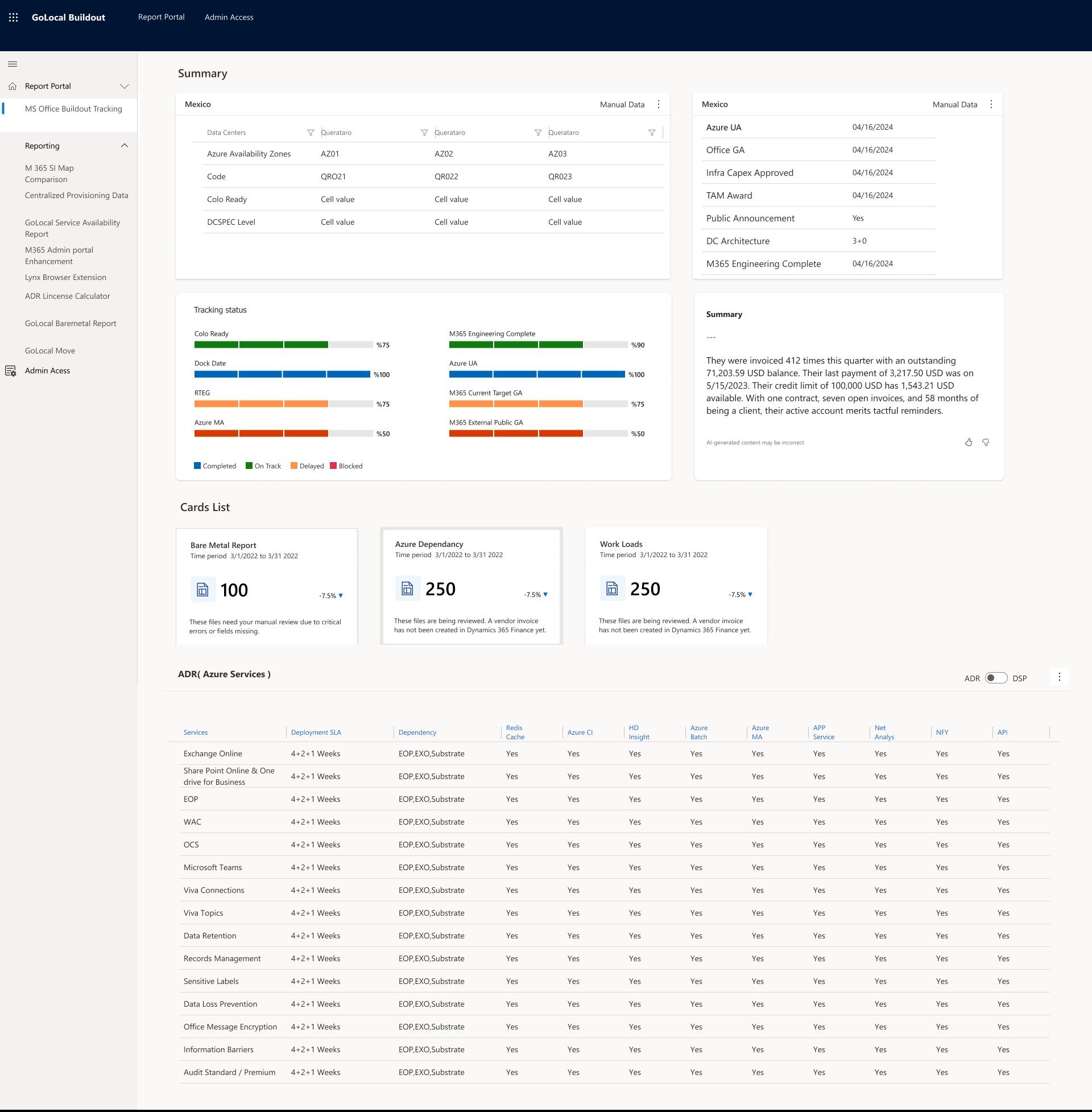
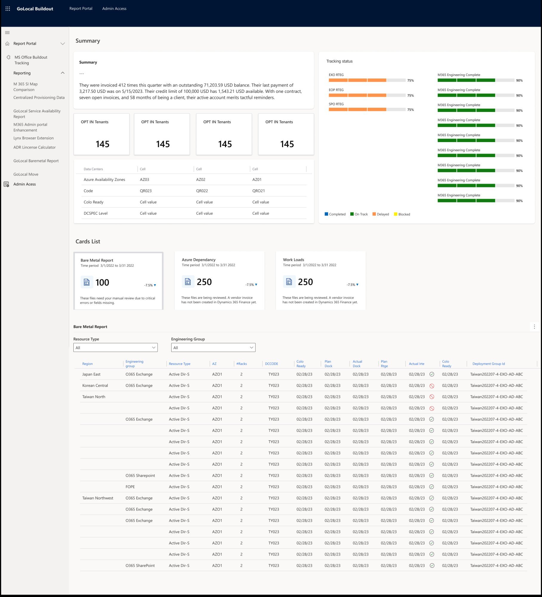
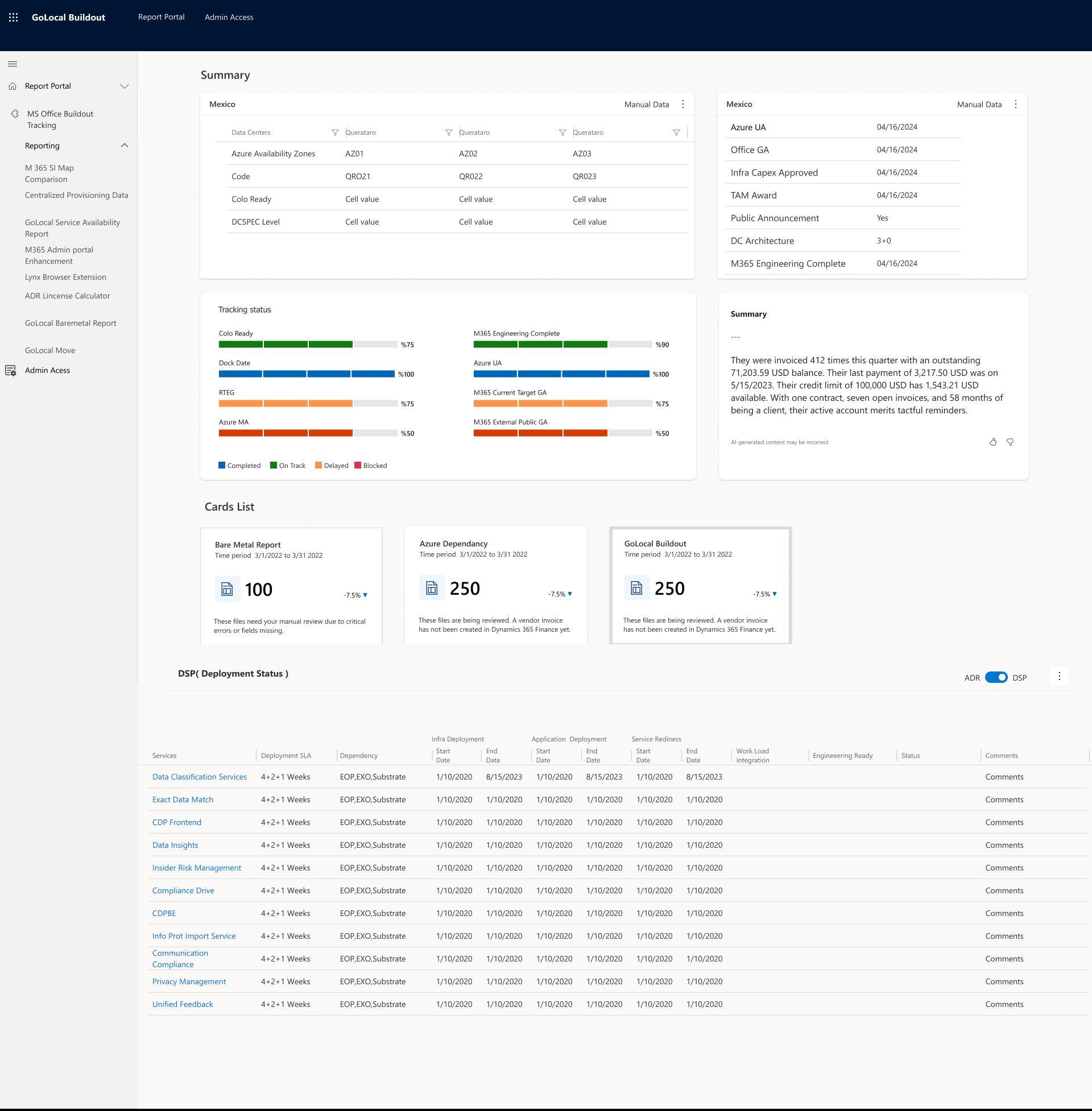
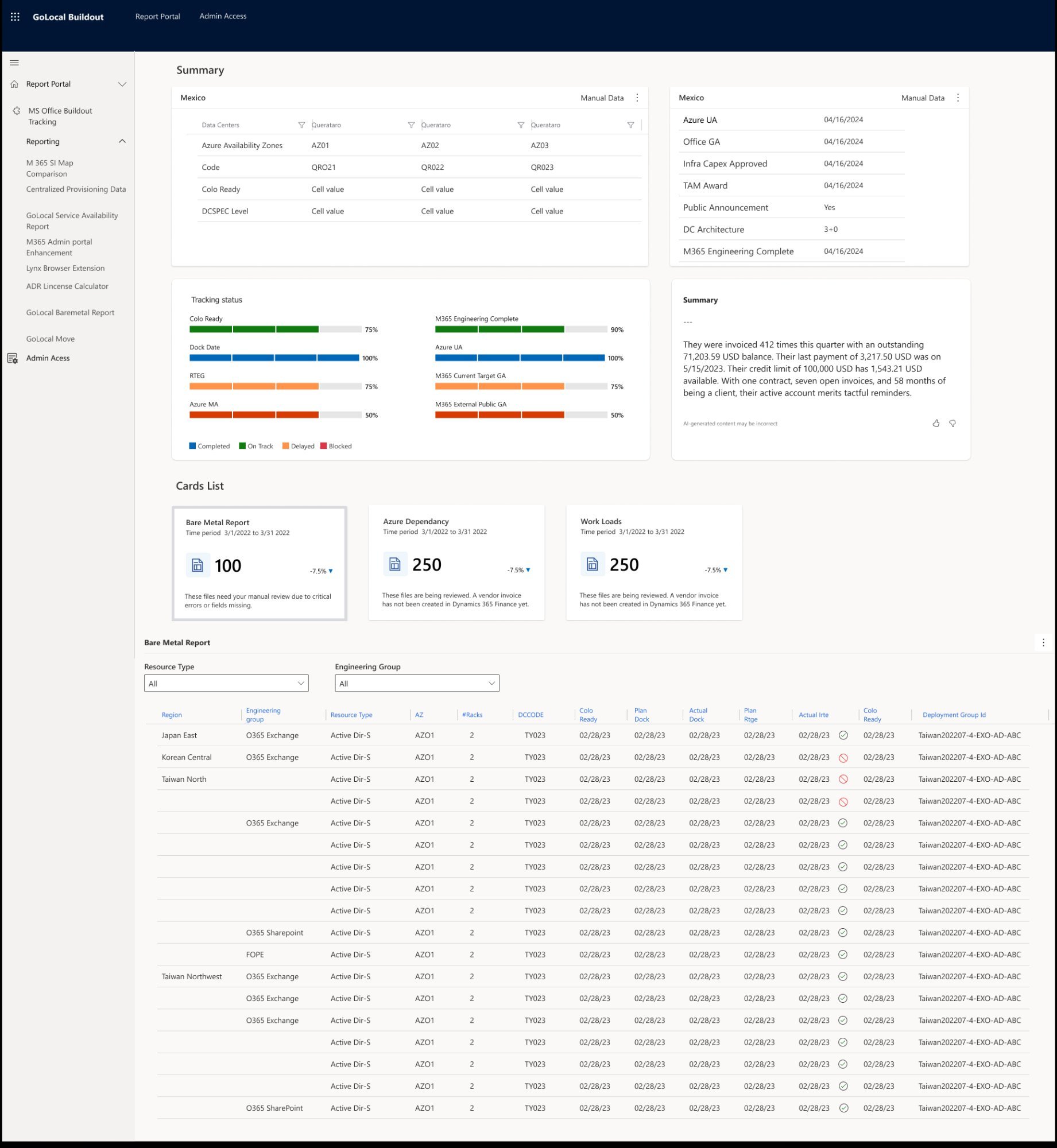
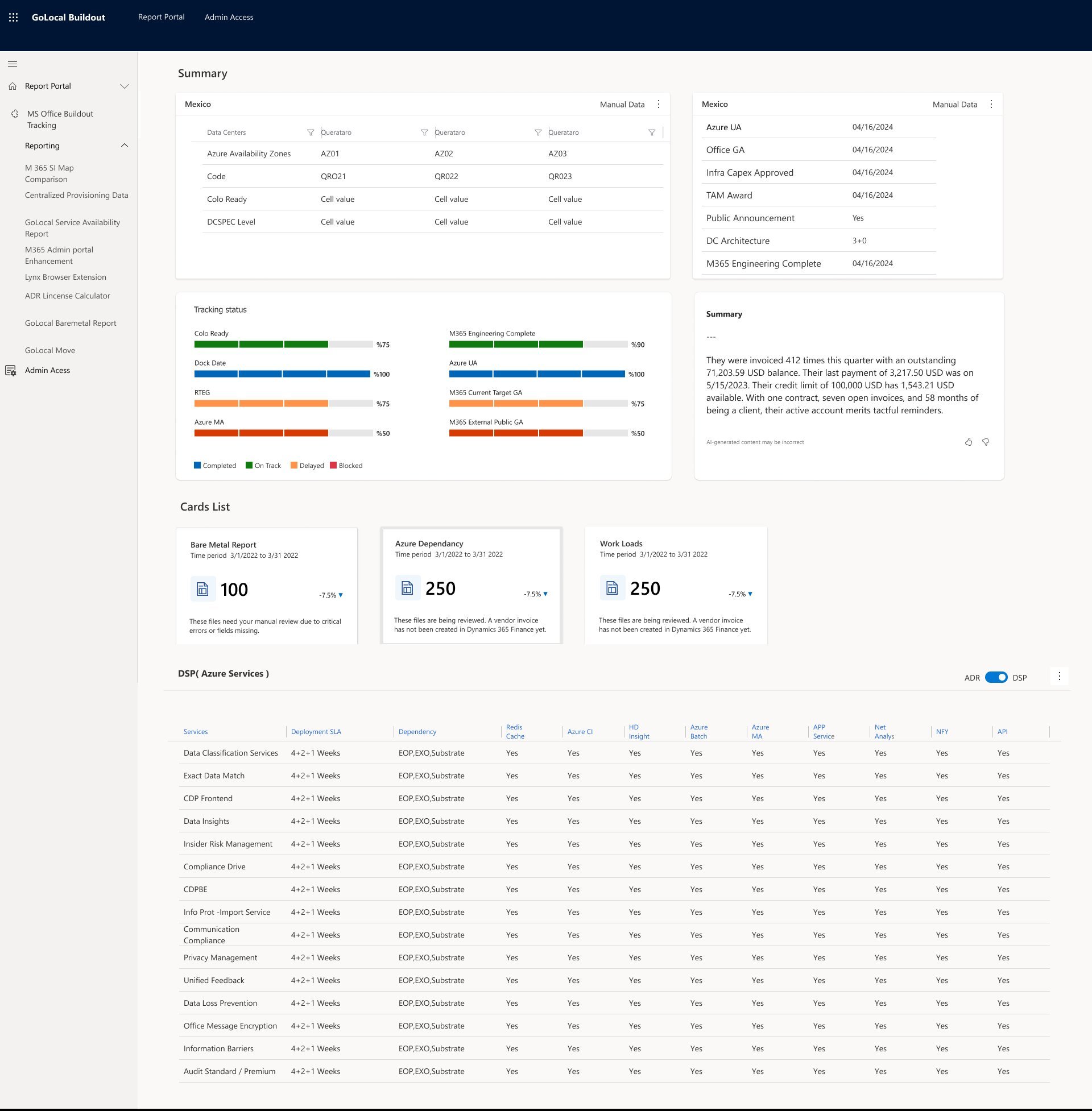
I led the end-to-end design of GOLocal Buildout for Microsoft's M365 global deployment program. A 13-person team responsible for expanding cloud infrastructure into 40+ countries simultaneously was managing everything in Excel spreadsheets and 4 disconnected tools. I reframed the problem from a data visualization task to a situational awareness challenge — and designed a unified deployment dashboard that gave the team real-time visibility, reduced decision latency, and eliminated the need for daily manual data consolidation.
I owned this project end-to-end as the sole Product Designer — from research and problem framing through to final handoff and post-launch support.
Sole designer on a 13-person cross-regional engineering team.
One team. 40 countries. Zero unified visibility.
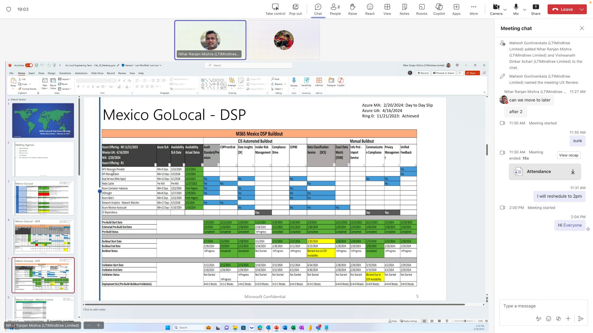
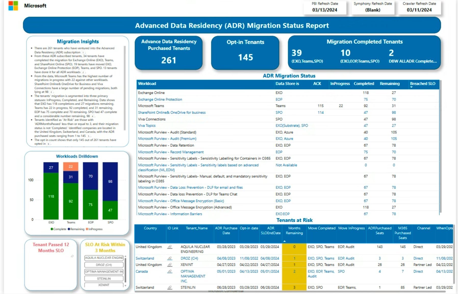
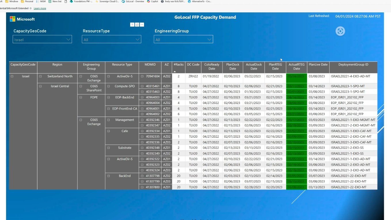
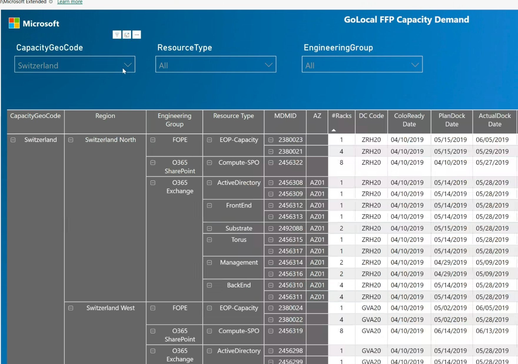
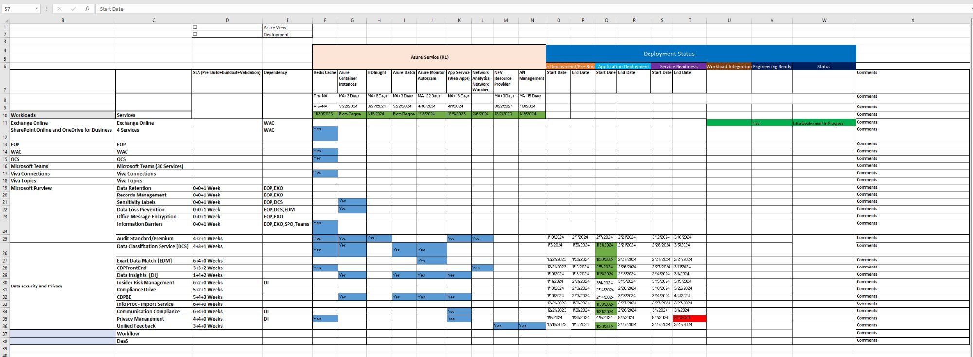
A 13-person team responsible for expanding Microsoft's M365 cloud infrastructure into 40+ countries simultaneously — Germany, Israel, Poland, Mexico, and dozens more. Each market with its own data center requirements, local compliance rules, and workload dependencies. They were managing all of it in Excel spreadsheets and 4 disconnected tools.
The moment I knew: When I mapped the full deployment journey — from business evaluation through data center planning to market launch — I identified 7 handoff points where information was supposed to move between people. At 5 of them, it got lost, delayed, or duplicated. I reframed this immediately: that was not a process problem. That was a design problem.
One tool. Three user types. Very different needs.
The GOLocal team wasn't a monolith — I identified three distinct user groups with different information needs, different workflows, and different tolerances for complexity. Designing for one without understanding the others would have produced a tool that worked for nobody.
AEIOU framework. Observe before designing.
Five decisions that changed how the tool works.
I wasn't trying to optimize everything at once. I focused on the decisions that would remove the biggest sources of friction — each one made from evidence, not assumption.
What I chose not to solve.
Scope discipline is a design skill. These were deliberate calls — not gaps.
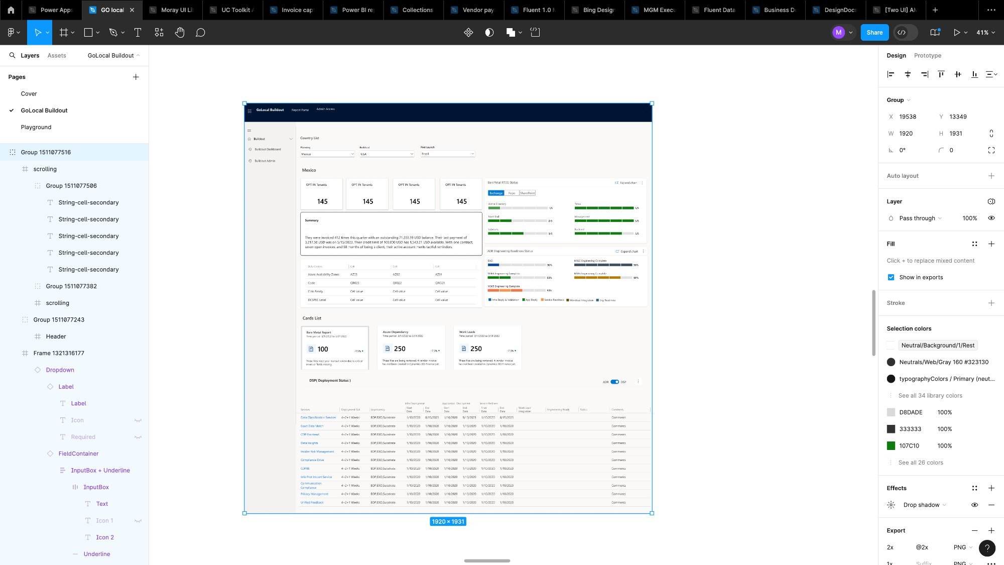
Four versions. Each one earned.
I did not jump to high fidelity. On a data-dense enterprise tool, skipping low-fidelity work is how you build a beautiful interface that does not fit the information it needs to display. Each version was a direct response to what the team and the data told me was wrong with the previous one.
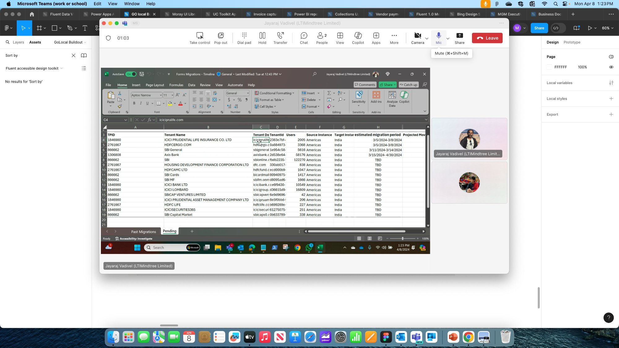
Forms Migration — Tenant Onboarding
Alongside GOLocal Buildout, I designed a second internal application within the same Microsoft M365 engagement: the Forms Migration app. This tool was used to onboard corporate clients into specific countries — managing the tenant migration process from application through to go-live.
The core workflow: add a tenant, configure their GEO, set user counts, confirm migration details, and initiate the migration. Before this app, the team tracked tenant onboarding in Excel with no standardized flow and no confirmation states.