Case Study 01 / Cisco / Enterprise UX

Cisco Learning.

Redesigning how 500,000+ IT professionals discover training, certifications, and partner tools — from a platform fighting itself to one that actually works.

Role
Product Designer & Product Owner
Company
Cisco Systems
Timeline
6 months — End to End
Team
2 Engineers, 1 QA
Platform
Web · Partner Portal
Tools
Figma · Miro · Jira · Muse DS
25%
Task Completion Rate increase from a 73% failure baseline
40K
New registrations in 30 days post-launch
13.13%
Sustained conversion rate increase post-launch
Clarify
The Problem

73% of users couldn't find what they came for. In 2 minutes.

Stakeholders came in asking for a visual refresh. Four weeks of research before opening Figma revealed something they hadn't expected: the navigation architecture was fundamentally broken, and no amount of visual polish was going to fix it.

Old CLN public landing page

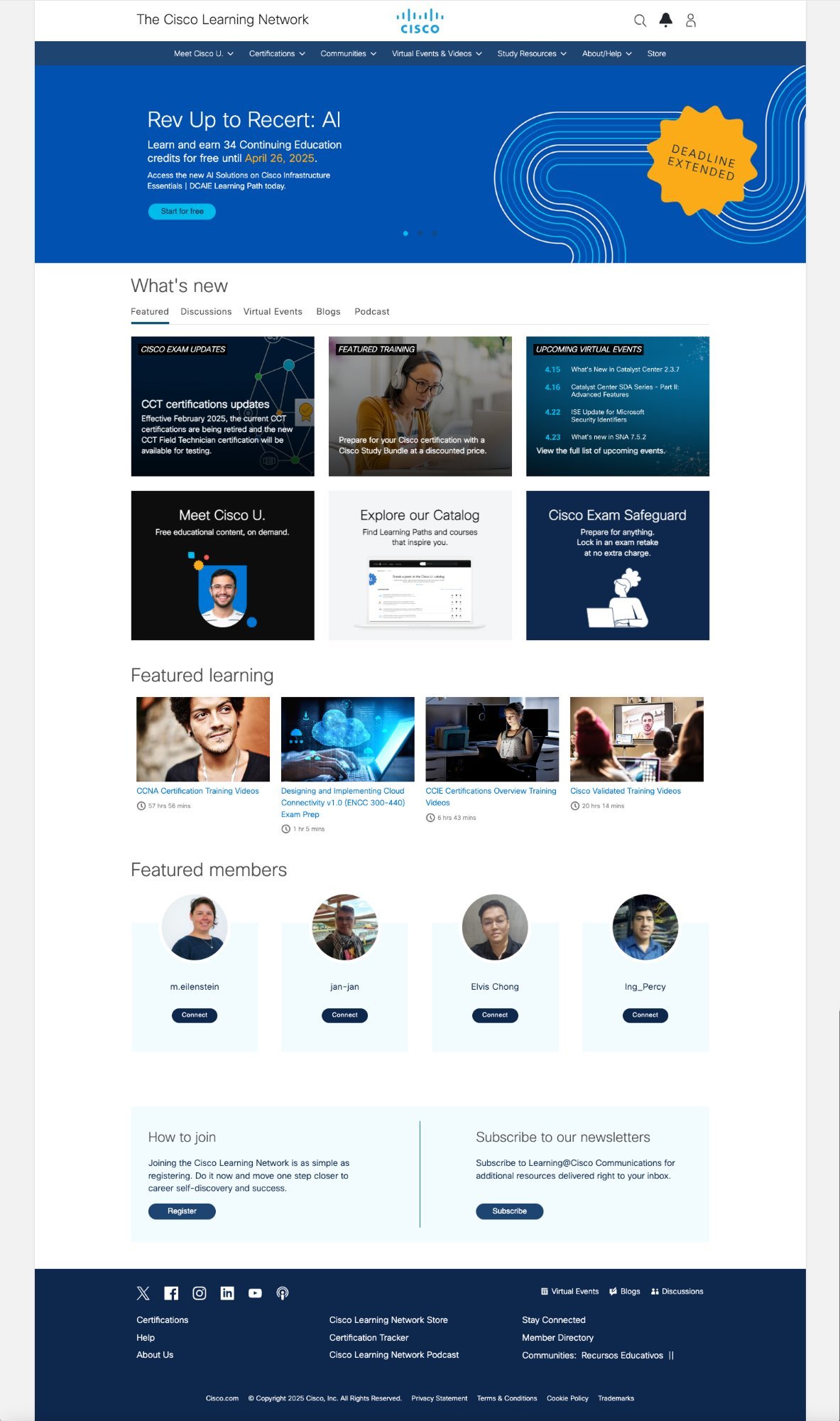
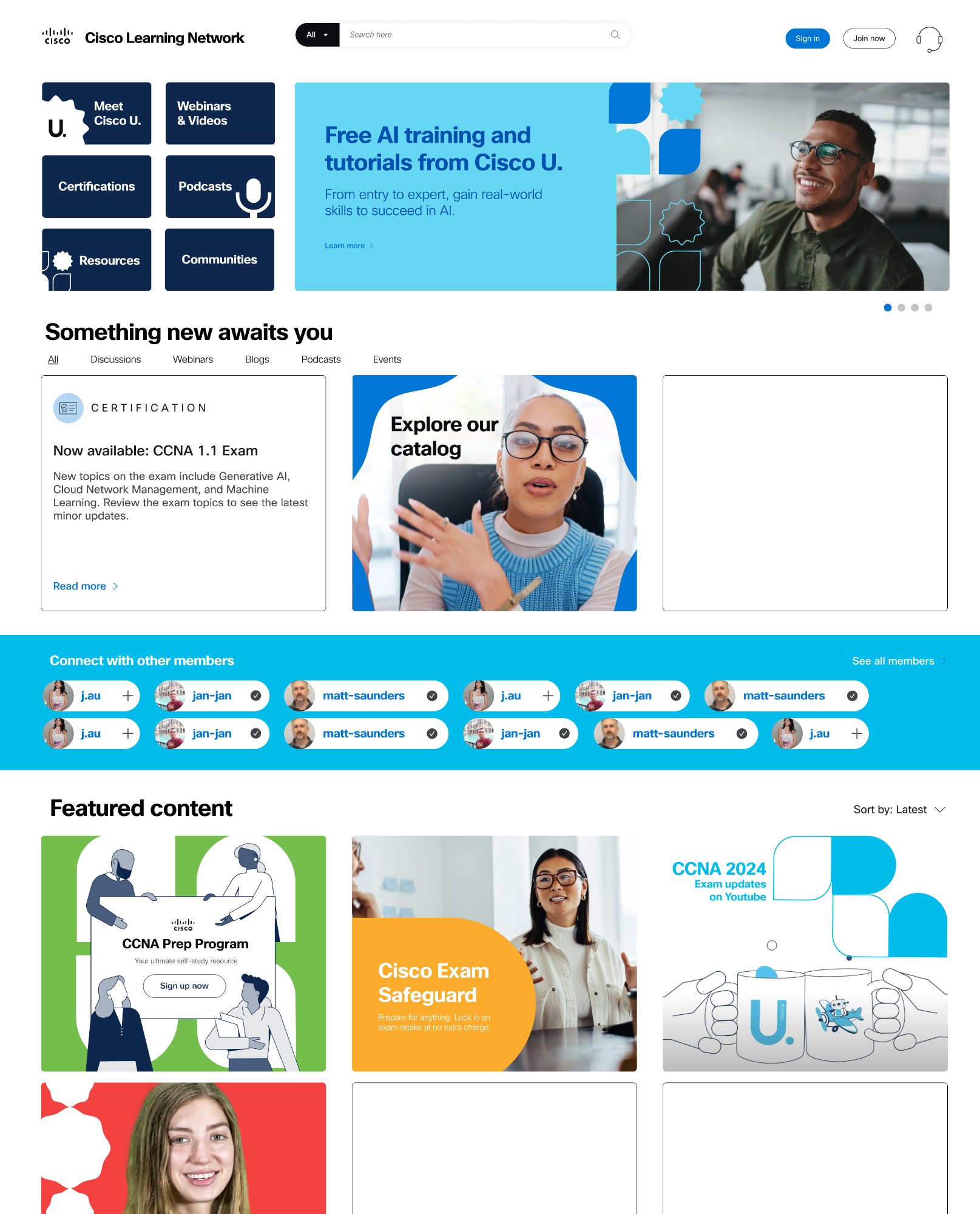
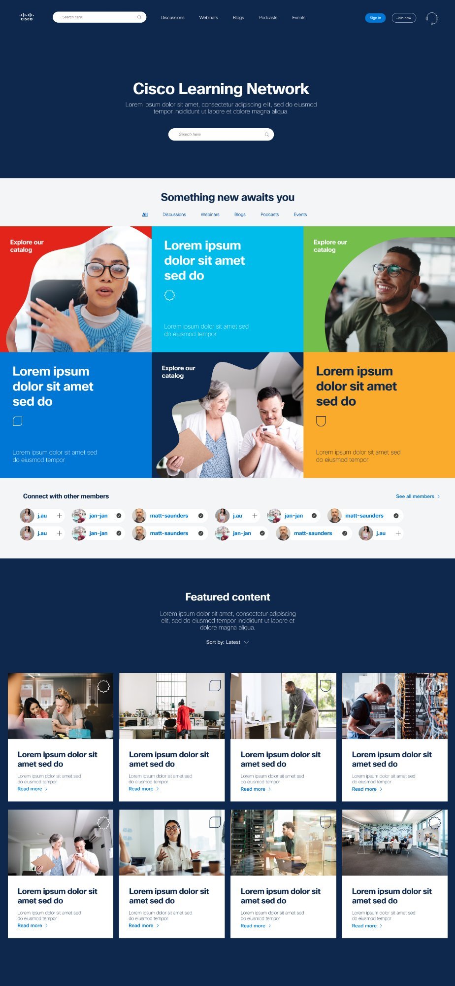
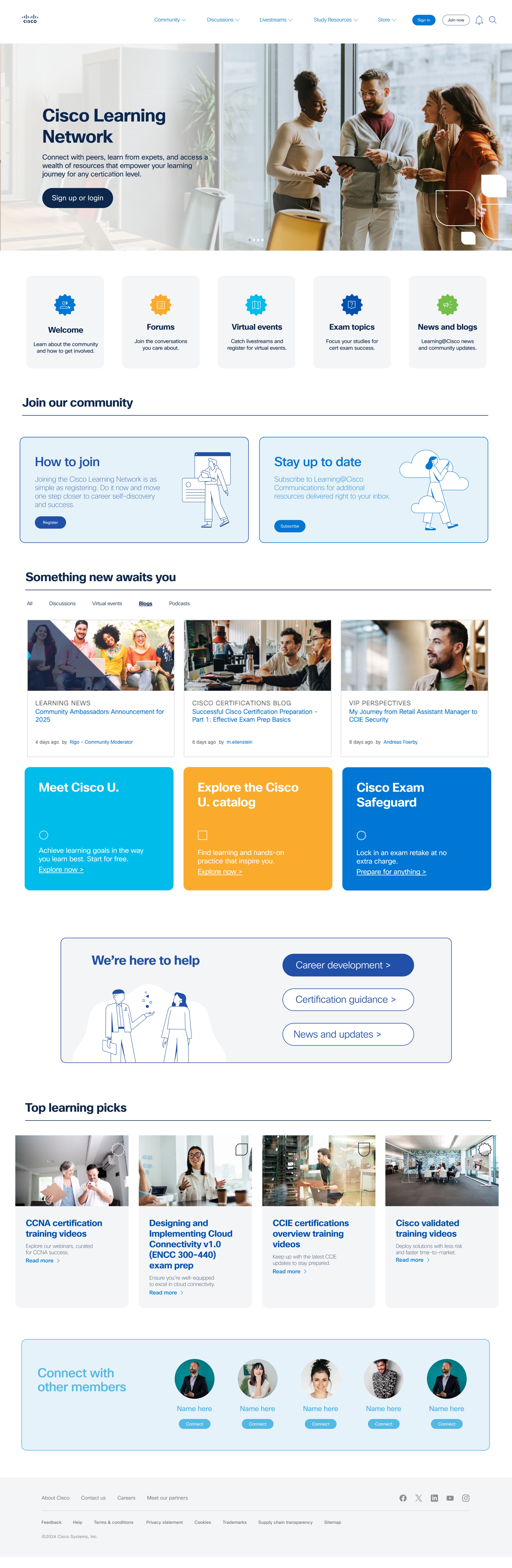
Old public landing page — competing CTAs, no hierarchy, overwhelming on first visit

73%

Navigation Failure

Users bouncing before reaching any content. The entry point was the obstacle — not the content behind it.

50ms

Trust Eroded Immediately

Competing CTAs and no visual hierarchy destroyed confidence before the first click.

Weekly

Partner Support Overhead

Learning partners stopped using the platform for seat management and called support instead.

Zero

No Behavioral Data

No analytics, no heatmaps, no session data. Every product decision made on gut feel.

Old CLN authenticated homepage

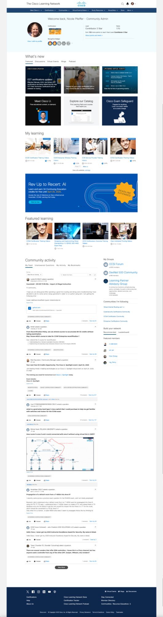
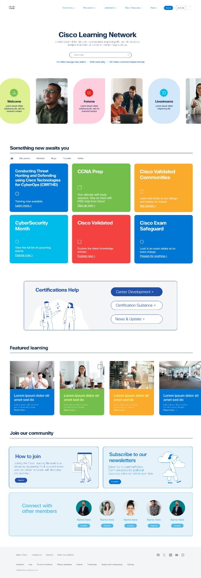
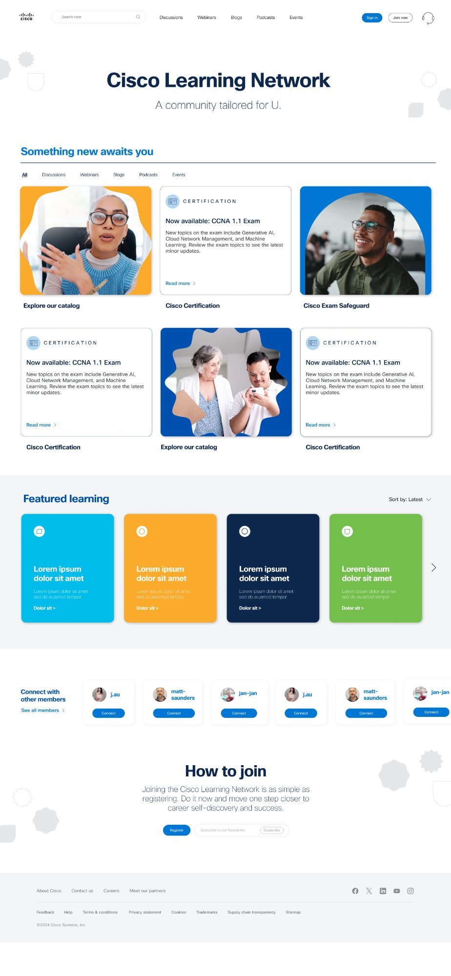
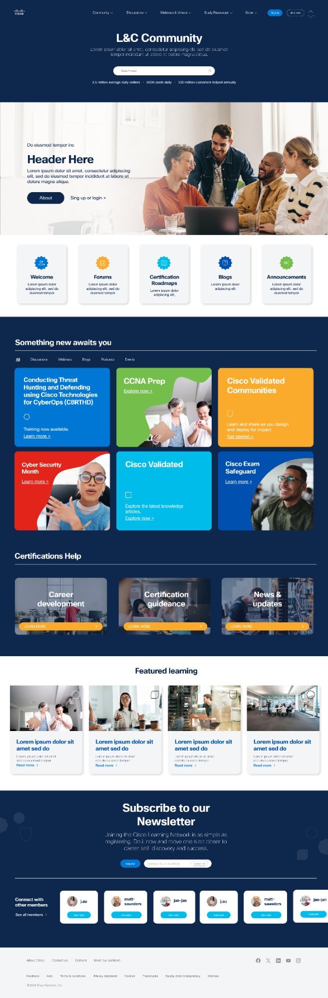
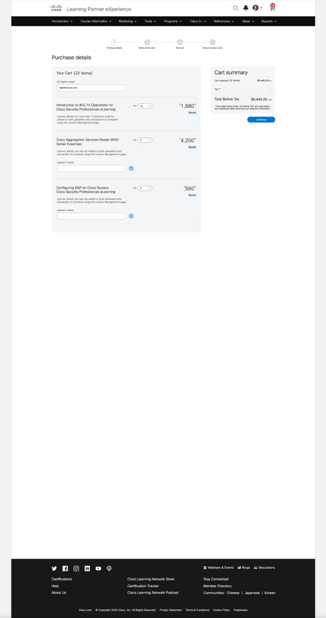
Old logged-in experience — community, certifications, and promotions all competing with equal weight

Old CLN with QA annotations

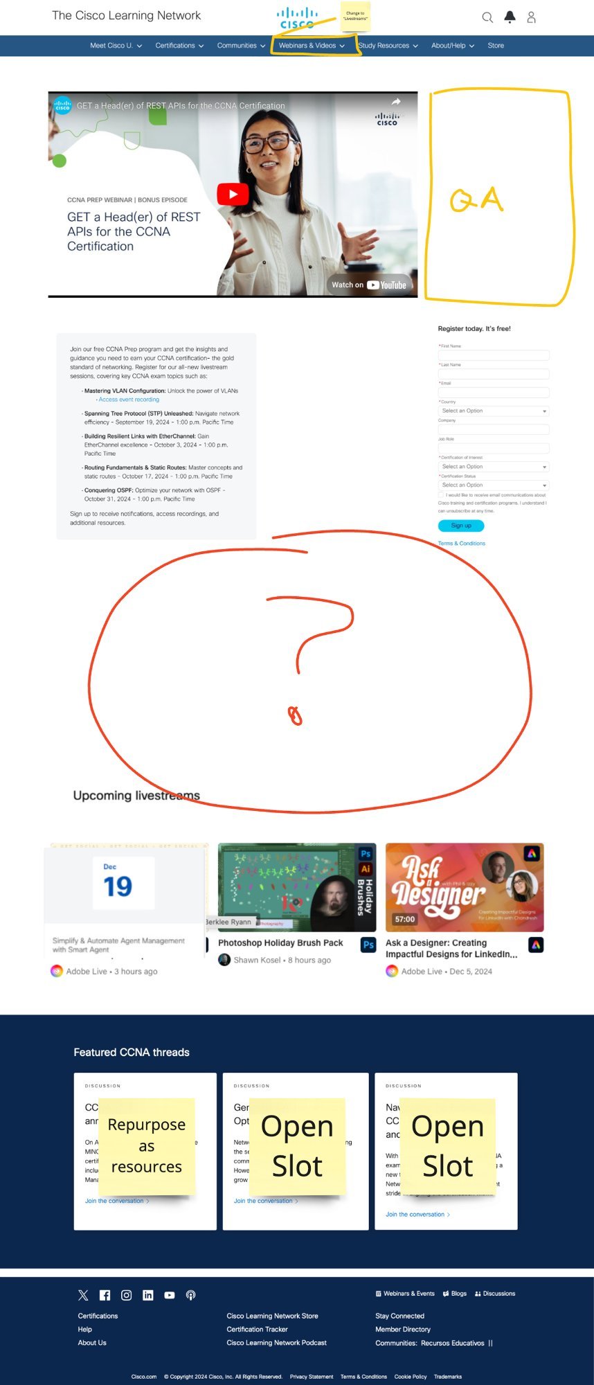
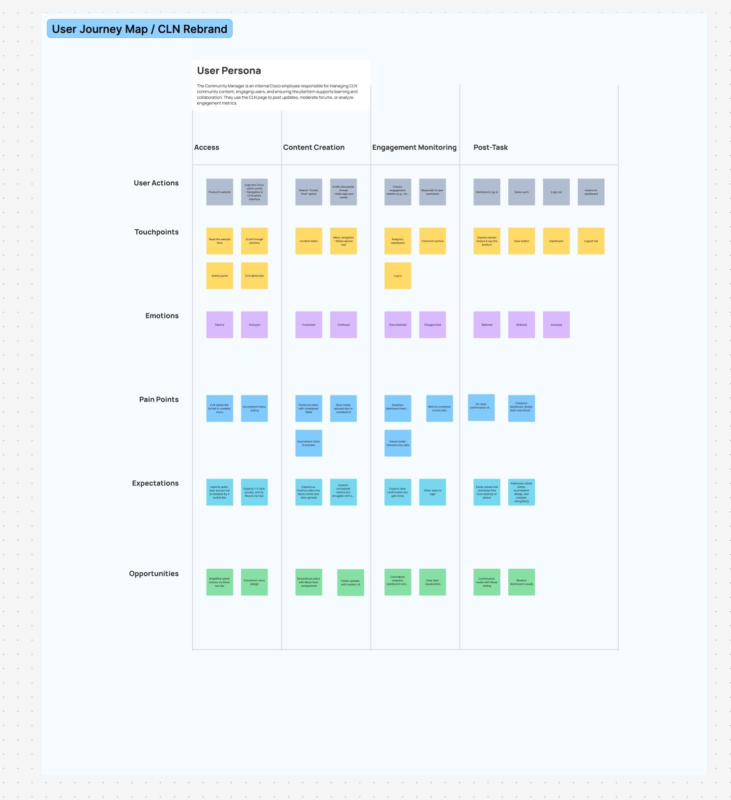
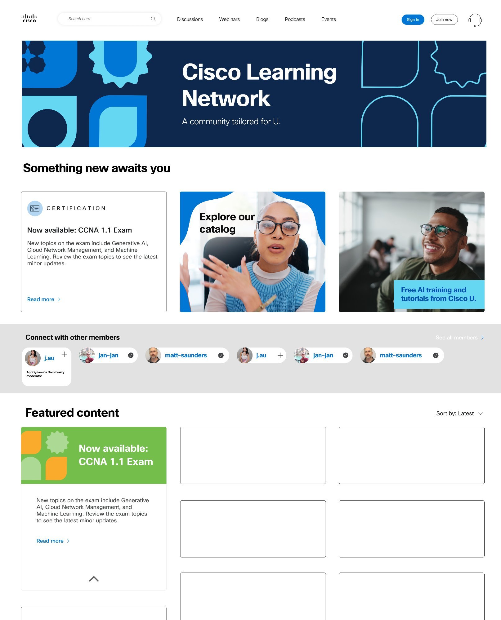
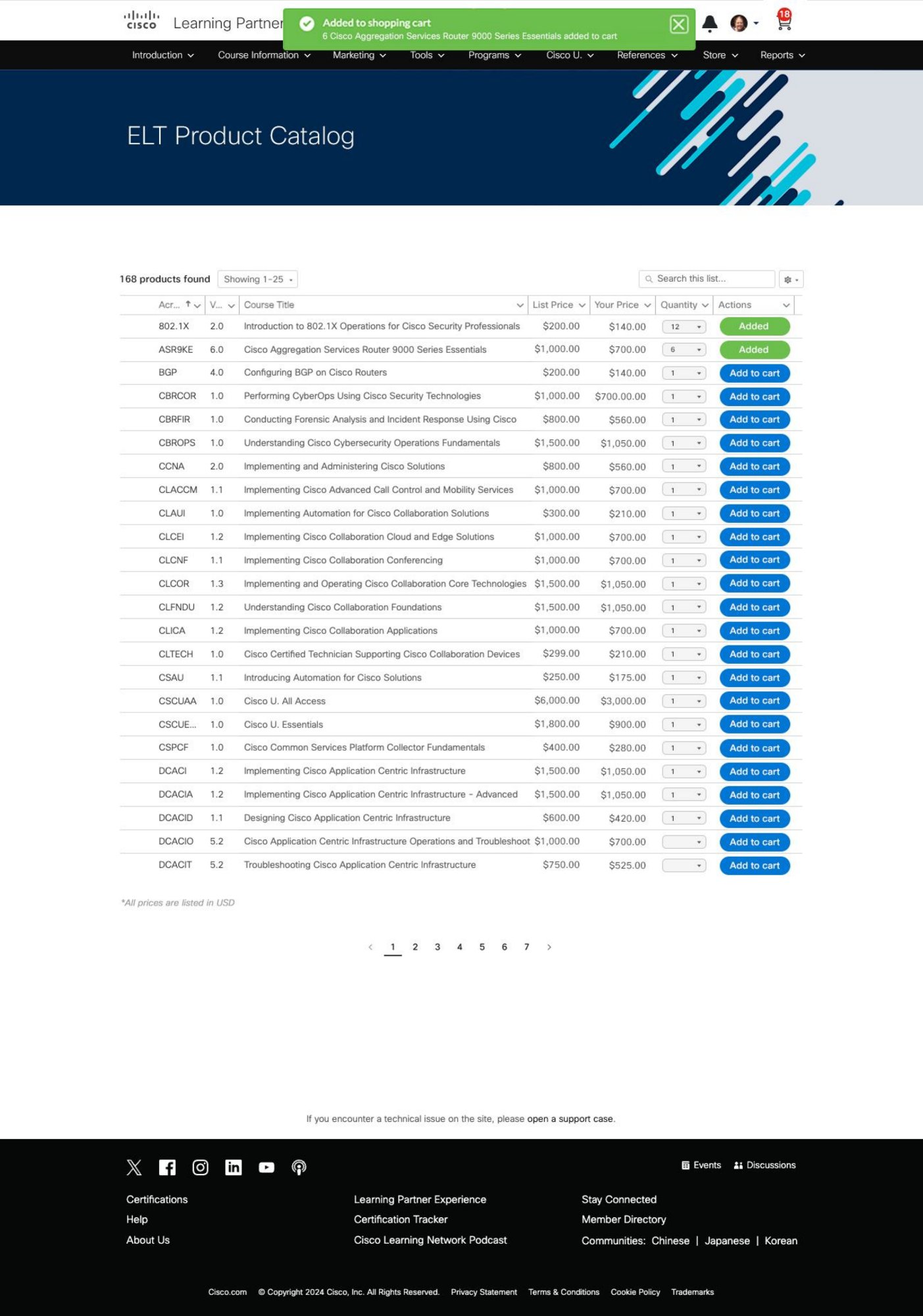
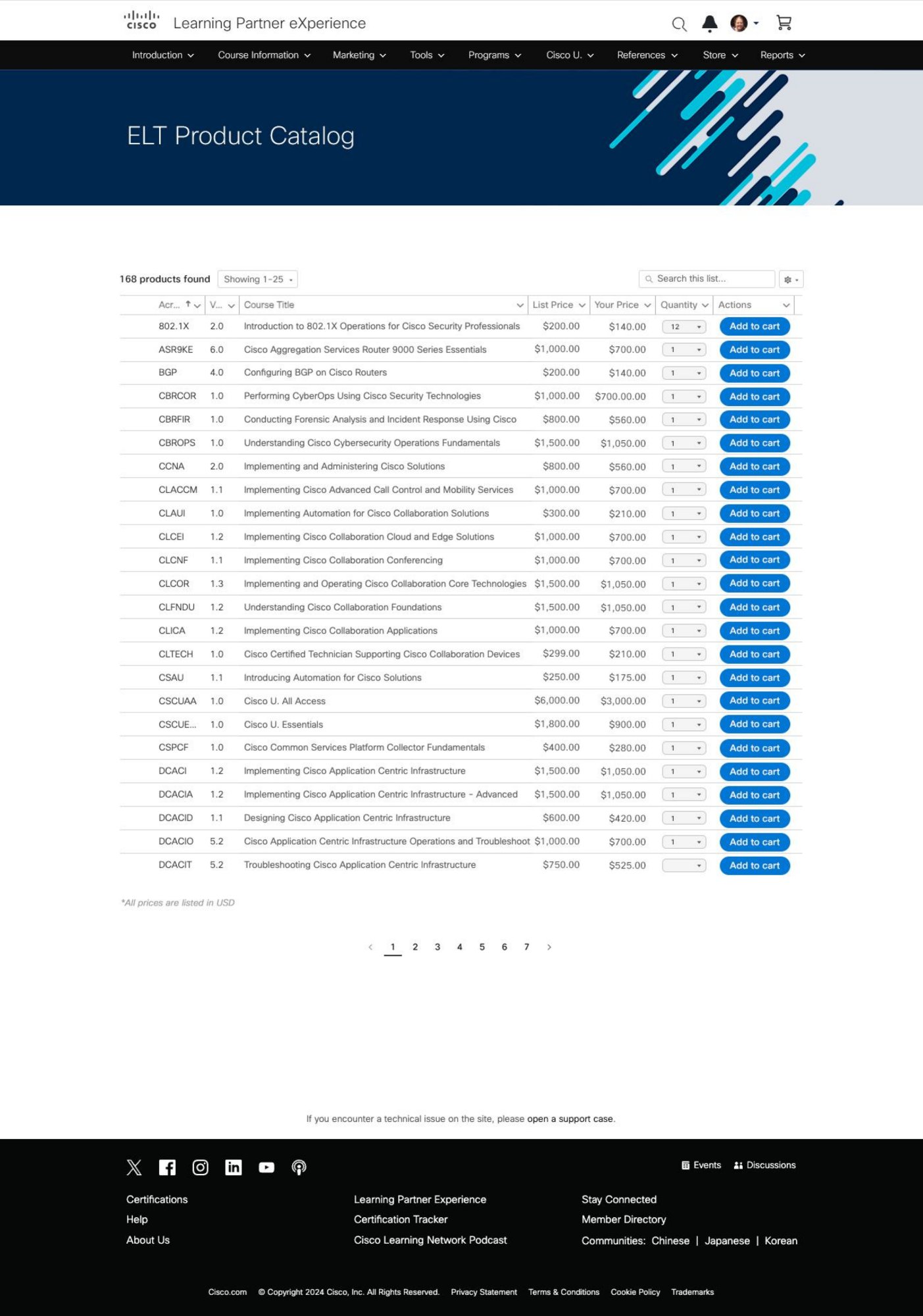
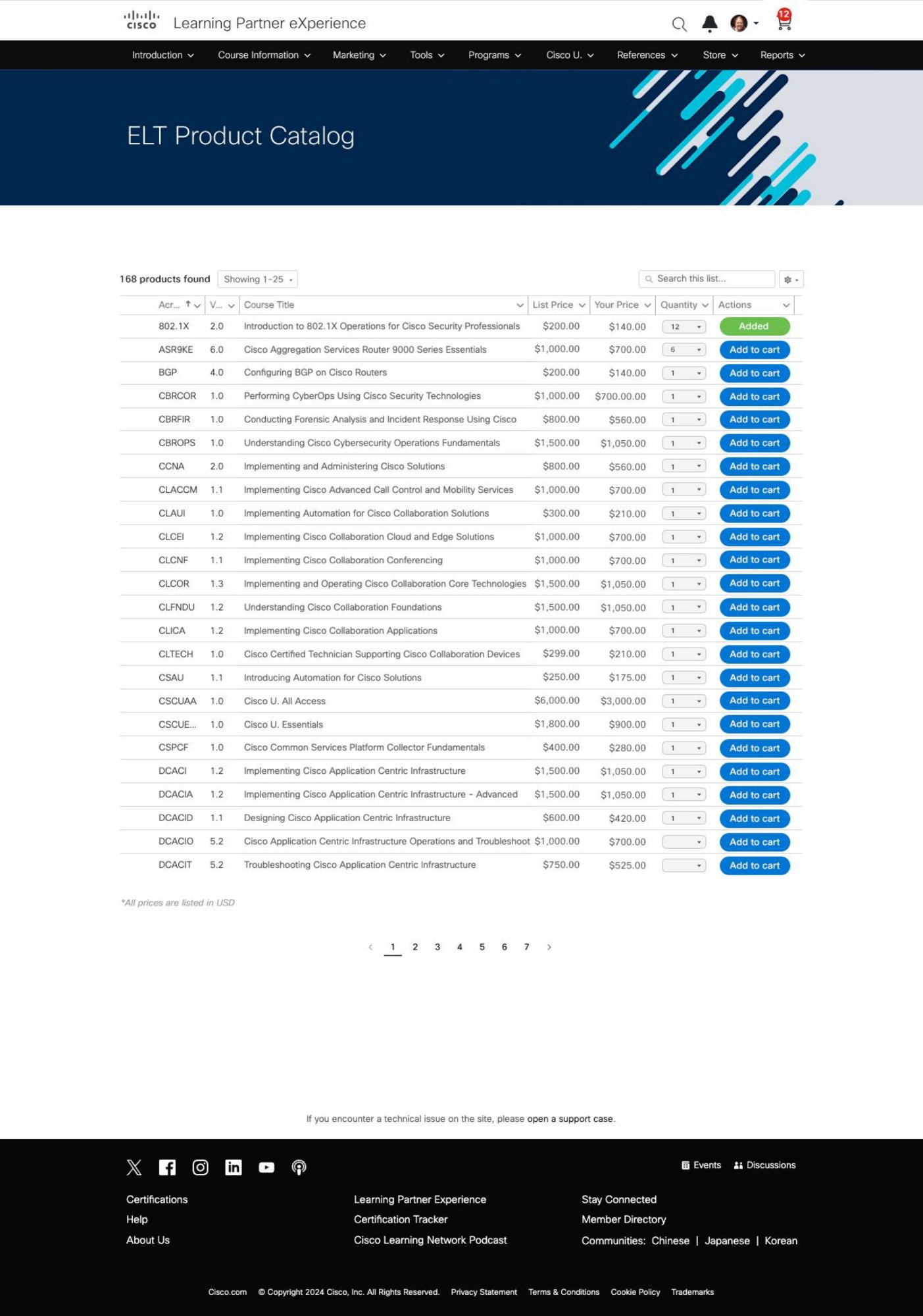
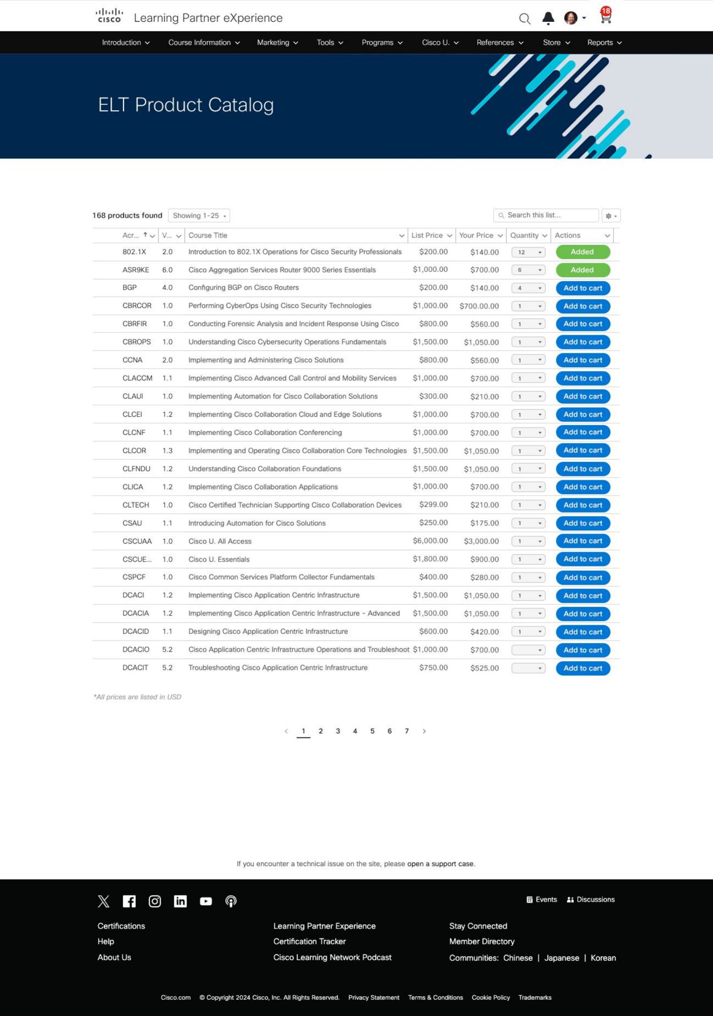
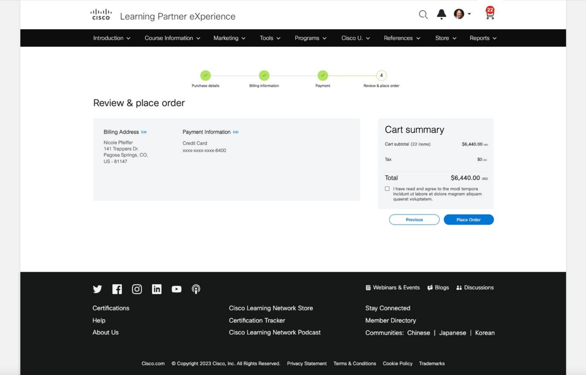
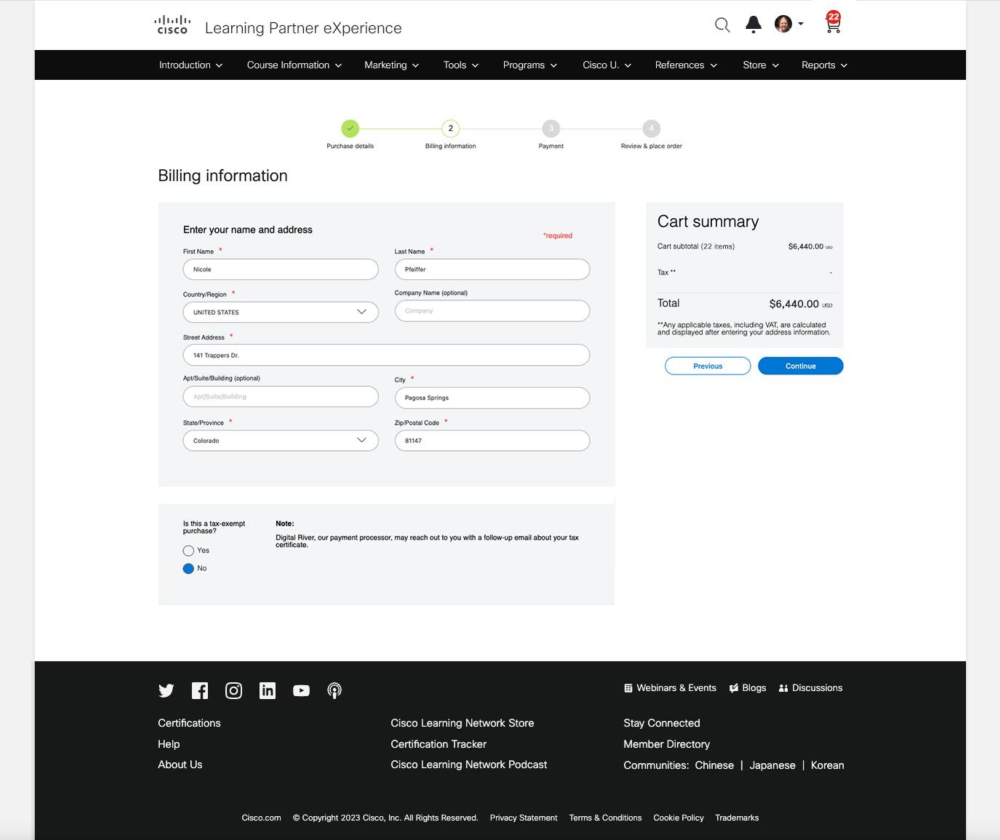
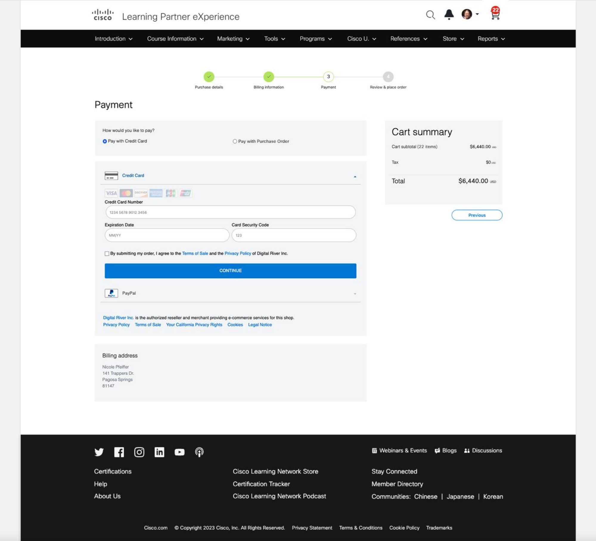
Platform in active QA review — annotations marking navigation failures and structural issues

Stakeholders wanted to move fast. I pushed for four weeks of research before opening Figma. The data justified every day of it — and I had the numbers to back that call when the pushback came.

Who We Designed For

Two audiences. One platform. Very different mental models.

The CLN serves two fundamentally different user types with different goals, different tasks, and different tolerances for friction. Designing for both without creating conflict was a core challenge of the project.

Primary — Certification Learner
Alex Kim
Network Engineer, 3 years exp, pursuing CCNP
"I know what cert I need — I just can't figure out where to actually start on this platform."
What he needs
  • Certification paths surfaced immediately — not buried 3 clicks deep
  • Community study groups connected to his cert journey
  • A clear starting point on first visit
What the platform was doing instead
  • 300+ links with no hierarchy or grouping logic
  • Community buried and disconnected from cert content
  • No personalized entry point for any user type
Secondary — Learning Partner
Maria Reyes
Training Manager, Cisco Gold Partner, 8 years
"We're supposed to use this portal to buy training seats — half my team gave up and calls support instead."
What she needs
  • A dedicated partner portal — not a shared learner experience
  • Bulk seat management without a maze of steps
  • Team learning progress visible in one view
What the platform was doing instead
  • No separation between partner and learner navigation
  • Seat purchase flow requiring support calls to complete
  • No team dashboard or renewal visibility
Research & Discovery

Four weeks of research before opening Figma. Here's what we found.

We ran a five-stage journey mapping workshop with cross-functional teams — product, engineering, QA, and community managers all in the room together. Combined with platform analytics and direct user interviews, four clear friction patterns emerged.

CLN User Journey Map

User journey map — Access, Content Creation, Engagement Monitoring, Post-Task. Pain points, emotions, and opportunities across all stages

Navigation was the core problem

Users bouncing from the homepage itself before reaching any content. The obstacle was the front door, not what was behind it.

Content fragmentation was systemic

300+ links. No consistent grouping logic. Certification resources, community, and learning lived in separate silos.

Manual maintenance was unsustainable

Community managers tracking broken links weekly. No content governance. Every update required human intervention.

Zero behavioral data

No analytics, no heatmaps, no session recording. Instrumentation had to be built into the redesign from day one.

Stakeholders expected a visual refresh. The research reframed the brief entirely — this wasn't a UI problem, it was a navigation architecture problem. That reframe changed everything that came after.

Key Insights

Five weeks of discovery distilled into five decisions.

Research is only useful when it changes what you build. Each insight below led directly to a structural design decision — something that changed how the platform works.

01

Certification is the primary job to be done

The platform was designed like a content portal. It needed to behave like a goal-completion tool.

Design response: Certification paths surfaced above the fold. Every homepage section earns its place by supporting the certification journey.
02

Navigation complexity was eroding trust

300+ links didn't just confuse users — it made the platform feel unreliable. When users can't find what they need, they lose confidence in the product.

Design response: Restructured IA into five clear top-level categories. Reduced cognitive load before the first click.
03

Community needs to live inside the learning journey — not beside it

Community was a separate destination. Users who found relevant threads reported they were the most useful part of the platform. The problem wasn't the community — it was the separation.

Design response: Community threads and study groups integrated into cert pages and the homepage feed.
04

Partners needed their own product — not a shared experience

Learning Partners had fundamentally different tasks. Forcing them through a learner flow was generating weekly support overhead and partner disengagement.

Design response: LPX built as a dedicated partner portal with its own navigation, dashboard, and task flows.
05

Without data, improvement is guesswork

The platform had no behavioral analytics. Post-launch measurement wasn't an afterthought — it was built into the project brief from the start.

Design response: Analytics instrumentation scoped into the build alongside Marketo campaign integration.
Ideate
Information Architecture

The first design decision wasn't visual — it was structural.

Coming directly out of the journey map, the navigation architecture needed a complete rebuild. 300+ fragmented links restructured into five top-level categories: Certifications, Community, Learn and Cisco U., Partner Portal (LPX), and Help and Support. That constraint was deliberate — it forced prioritization decisions the team had been avoiding for years.

Before — Fragmented
×300+ links, no grouping logic
×Certifications buried 3+ clicks deep
×Community and learning siloed
×No partner-specific navigation
×Manual updates required weekly
After — 5-Pillar Structure
+Five categories, clear mental model
+Certifications surfaced first scroll
+Community integrated into cert journey
+Dedicated LPX partner portal
+Content governance streamlined
Design Goals

From insights to intent. What we were actually trying to solve.

Six measurable goals. The filter for every decision — if a design choice didn't serve at least one of them, it didn't make the cut.

01

Surface certification paths within the first scroll

If a user couldn't see it without scrolling, we had already failed.

02

Reduce navigation from 300+ links to a scannable structure

Not a visual cleanup — a structural one. Five categories. Clear mental model after one visit.

03

Integrate community into the learning journey

Study groups needed to feel like part of pursuing a cert — not a detour from it.

04

Eliminate partner friction from the seat purchase flow

Zero support tickets for routine partner operations post-launch.

05

Establish a measurable post-launch baseline

Ship with analytics in place so every future decision could be evidence-based.

06

Design a system, not a page

Scalable component structure that wouldn't drift the moment the first content update went live.

Design
Design Process

Structure was set. Now the visual work began — grounded in the architecture defined in Ideate.

Visual Direction & Moodboarding

Before any wireframe, the team needed a shared visual language.

Two rounds of competitive and inspirational research — pulling references across community platforms, enterprise learning tools, and consumer apps that handled information density well. The goal was to build a shared vocabulary for what "trustworthy, engaging, and structured" looks like before opening Figma.

Research moodboard stage 1 Research moodboard stage 2

Two rounds of moodboarding — visual references for layout, color blocking, and interaction patterns

Design System

Working within Muse — and pushing it where it needed to go.

The CLN redesign had to operate within Cisco's Muse design system. Color tokens, type hierarchy, layout grids, and iconography all mapped and documented before any UI work began. Knowing the system constraints upfront prevented rework downstream.

Muse design system foundations

Muse design system — color, text styles, layout grids, iconography established before visual design began

Wireframes

Four key screens explored in low-fidelity before any visual design began.

The wireframe phase validated two things we hadn't anticipated. First, community managers needed content governance controls built into the CMS — not just a better front-end. Second, partners consistently confused CLN navigation with partner-specific navigation when LPX was embedded as a sub-section. That confirmed LPX needed its own navigation system entirely — a decision that added scope but eliminated the single biggest source of partner confusion.

Concepts & Iterations

Four concepts. One clear winner. Here's why.

Four genuinely distinct visual concepts. Each answered the same question differently: what does trust look like for an IT professional preparing for a career-defining certification?

Concept 1
Concept 01

Let's Illustrate

Bold illustration-driven approach. Strong personality but risked feeling inconsistent with Cisco's enterprise credibility.

Concept 2
Concept 02

Minimalism is Line Art

Clean, structured, layout-led. Clear hierarchy but tested as underselling the platform's scale.

Concept 3 — Selected
Concept 03 — Foundation Selected

Bold and Community-Driven

40% higher dwell time in testing. Too aggressive in V1 — but the hypothesis was proven. Used as structural foundation going forward.

Concept 4
Concept 04

Minimalism Variant

Felt like it undersold a platform of 500,000 learners in user testing.

Mode Exploration

Before committing to iteration direction, we explored both light and dark mode treatments to understand which carried the right balance of warmth and credibility.

Light mode exploration Dark mode exploration

Light vs dark mode — testing which treatment carried community energy without sacrificing readability at scale

Iterations — V1 through Shipped

V1 pushed the Concept 3 direction as far as it could go. V2 pulled back the intensity and reintroduced grid discipline across several sub-iterations. V3 found the balance. Zero redesign requests after the final stakeholder presentation.

Version 1
Version 01

Bold and Exploratory

"Too much happening — simplify."
Version 2
Version 02

Refined and Structured

"Getting there — add warmth."
Version 3 — Shipped
Version 03 — Shipped

The balance point

"This is it." Zero redesign requests.

V2 Sub-Iterations

The V2 phase involved the most iteration — testing color blocking, hero treatments, and content hierarchy across four distinct passes.

V2bV2c
V2dV4 near-final

V2 sub-iterations — color blocking, hero treatments, and navigation refinement across four passes

Shipped

The structural decisions made in Ideate, now visible.

The before and after here isn't a visual comparison — it's a structural one. The same entry point, redesigned around user goals instead of content volume. Certifications above the fold. Community integrated into the primary scroll. Navigation reduced from 300+ links to five categories a user can hold in their head after a single visit.

Before — old public landing
Before
After — final shipped with real content
After
Implement
Handoff & Build

I didn't hand off and step back. I stayed in the build.

Holding both the Product Designer and Product Owner roles meant the handoff wasn't a moment — it was a continuous process. I worked directly alongside the engineering team through delivery, reviewing components against Muse DS, catching drift between design intent and implementation, and making real-time scope calls when constraints surfaced.

Component QA against Muse DS

Every shipped component reviewed against Cisco's Muse design system. Tokens, spacing, and interaction states verified before sign-off — not after.

Real-time trade-off decisions

When engineering constraints surfaced mid-build, I made the call — not a separate PM. Fewer handoff loops. Faster resolution. Tighter output.

Analytics instrumentation scoped in

Behavioral tracking wasn't bolted on after launch. It was written into the build spec from the start — the only way to make post-launch measurement meaningful.

Zero redesign requests at final review

Stakeholder alignment held through delivery. The research and structured decision-making in earlier stages meant no surprises at the finish line.

Being both Product Designer and Product Owner removes the translation layer between design intent and product execution. I held both roles without letting either one compromise the other — and that tension was productive.

Measurement

Three numbers. Each one means something different.

Instrumentation was scoped into the build from day one — not added after launch. That decision is why these numbers exist at all. A platform with no behavioral data can't be measured. Measurement was a design decision, not a post-launch afterthought.

25%
Task Completion Rate
The direct inverse of the 73% failure rate we started from. A measurable proportion of users who previously failed are now succeeding.
40K
New Registrations in 30 Days
A user doesn't register unless they've understood the platform's value. The redesign removed the barrier to that moment.
13.13%
Conversion — Sustained
Maintained growth means a better ongoing experience — not just a better first impression. The word sustained matters.

What the numbers don't capture

Partner support ticket volume dropped after LPX launched. Community managers reported reduced manual intervention for broken links and outdated content. Stakeholders who had pushed back on the four-week research phase were citing the research findings in internal presentations months after launch.

The 40,000 registrations aren't a design metric. They're a business metric. That's the only kind that matters at this scale.

Trade-offs

What I chose not to solve.

A big part of senior design work is deciding what not to fix in the first release. Every trade-off below was a deliberate call — not a compromise.

01

Simplicity over maximum visibility

Some stakeholders wanted more links and destinations surfaced in navigation. I chose a tighter structure — clarity mattered more than visibility. I aligned decisions back to user goals and showed how reducing options improved success rates.

02

Structural fixes over visual exploration

It would have been easy to spend more time refining UI treatments early. I prioritized information architecture and core flows first — visual polish on a broken structure would have changed nothing measurable.

03

Separate partner experience over forced unification

Keeping learners and partners in one experience would have reduced short-term scope. But it would have preserved the biggest usability conflict in the product. I added scope to remove a systemic problem.

04

Foundational improvements over personalization

Personalization could have added value — but only after the base experience became understandable and measurable. You can't personalize a system users can't navigate. Foundation first.

These trade-offs weren't limitations — they were the strategy. Focusing on the highest-leverage problems first is what made the outcomes measurable.

Reflection

What I'd do differently. What I'd do exactly the same.

On the four weeks of research

It felt like a risk at the time. In retrospect, those four weeks were the most leveraged investment in the entire project. Every major design decision was defensible because it came from evidence. When pushback came, the data answered it.

On owning both design and product

Being both Product Designer and Product Owner removes the translation layer between design intent and product decisions — genuinely powerful. What I developed was the ability to hold both roles without letting either one compromise the other. That tension was productive — and I'd look for it again.

What I'd do differently

Instrument earlier. And involve community managers earlier in the IA phase. We caught two important issues at wireframe stage. We might have caught more with their operational knowledge from the beginning.

What this project confirmed

Enterprise UX at scale is not about making things beautiful. It's about making things work for people with real jobs, real time pressure, and real consequences when the platform fails them. The CLN serves IT professionals building careers, partners running training businesses, and a community of over four million certified learners. Getting the navigation architecture right — or wrong — has downstream effects on all of them.

New Product — Learning Partner eXperience

After CLN shipped, Cisco asked me to design the partner commerce experience. From scratch.

LPX — Learning Partner eXperience — was a net-new product, not a redesign. After the CLN launched, the biggest unresolved pain point was how Cisco's 800+ certified training partners purchased ELT (Electronic Learning Training) seats. The existing flow was a maze of disconnected pages that required support calls to complete. I was brought in as the sole designer to build a dedicated purchase experience — from the partner landing page through to order confirmation.

What you're seeing below is the ELT seat purchase flow — one of the core transactional journeys within LPX. From landing to catalog, through cart configuration and learner assignment, to order confirmation.

Entry Point
01
LPX Landing
LPX Landing
02
Store
Store → ELT Catalog
Cart — Adding Items
03
Cart
Cart Collapsed
04
1 added
1 Added
05
2 added
2 Added
06
3 added
3 Added
Quantity & Learner Configuration
07
Qty 1
Qty Change 1
08
Qty 2
Qty Change 2
09
Qty 3
Qty Change 3
10
2 learners
Expand 2 Learners
11
6 learners
Expand 6 Learners
12
Names
Assign Names
Checkout — Purchase Flow
13
Review
Review Order
14
Billing
Billing Info
15
Payment
Payment
16
Confirmed
Order Confirmed

Click any screen to expand

Key design decisions

Dedicated navigation system

LPX has its own top nav separate from the CLN learner experience. Partners no longer navigate a learner platform to complete operational tasks.

Inline learner assignment

Partners assign named learners to seats directly in the cart, before checkout — eliminating a post-purchase admin step that required a support email.

Progressive cart states

Every state between "empty" and "ready to purchase" is explicitly designed. No ambiguity at any step.

4-step checkout with progress visibility

Purchase details, billing, payment, and review — each a distinct step with a persistent stepper. Partners always know where they are.

Partners disengaging from the platform wasn't just support overhead. Partners are the organizations training the next generation of Cisco-certified professionals. LPX had a direct line to a business outcome.

×