Executive Summary
I led the end-to-end design of PrimeroEdge 2.0 Insights — a K-12 school nutrition data module — as the sole Product Designer over 18 months. The brief was to make nutrition data useful. What I found during research reframed the problem entirely.
Cybersoft's data team had built something comprehensive: meal participation rates, nutritional breakdowns, allergy flags, USDA compliance metrics across 9 districts. Nobody was looking at it. The problem wasn't data availability — it was that the system was designed for reporting, not deciding. I used the Design Thinking framework — Clarify, Ideate, Develop, Implement — to move from that diagnosis to a shipped product that non-analyst administrators could actually use.
My Role
Sole designer from data architecture conversations through post-launch iteration. This project required working upstream of design — understanding what data was reliable before deciding what to surface.
I worked with the data team before any user research
I ran quantitative and qualitative research in parallel
I ran card sorting with sales and support teams
I designed three distinct concept directions for comparison
I owned WCAG compliance and accessibility audit
I wrote all dev annotations and owned QA through launch
Sole designer. 18 months. 9 district rollouts. Real stakes.
Research Framework
Clarify, Ideate, Develop, Implement. Why Design Thinking here.
Design Thinking is the right framework when the problem is genuinely ambiguous at the start — when you can't trust the brief to tell you what to build. For PrimeroEdge, the brief was "improve the data module." That's not a design problem. It's a symptom description. Clarify → Ideate → Develop → Implement forced a full problem diagnosis before a single screen was proposed.
Each phase had a specific gate. Nothing moved forward until the gate was passed — which sounds slow, but eliminates the most expensive category of rework: building the right thing wrong, or worse, building the wrong thing right.
01
Clarify
Understand the real problem — not the stated one
02
Ideate
Generate multiple directions before committing to one
03
Develop
Build and test the chosen direction with real users
04
Implement
Ship with full production ownership through launch
The stated problem: the data module needs to be better. The real problem — found in the Clarify phase — was more specific and more actionable: non-analyst users were bypassing the dashboard entirely because they couldn't tell which numbers required action and which were just noise. That distinction changes everything about what needs to be designed.
I made one unconventional decision before speaking to a single user: I spent the first two weeks with the data team. Understanding what data existed, what was reliable, and what was technically possible to surface prevented designing around numbers that would mislead rather than inform. You cannot design a good data product without understanding the data first.
"The data team showed me everything available — meal participation, nutritional breakdowns, allergy flags, district trends. Then someone said: we have all this. Nobody looks at it. That was the actual design brief."
— Mahesh · Pre-research session · Cybersoft data team
01
Data architecture review before user research
Before any user interviews, I mapped every available data point, its reliability, its update frequency, and its decision relevance. This produced a data inventory that became the constraint set for the entire design. Result: 3 data categories marked as unreliable for v1 display — removing them early prevented a significant user trust problem post-launch.
02
Quantitative and qualitative research run in parallel
Analytics and surveys identified behavioral patterns — including that users were bypassing the main dashboard entirely and going to raw exports. One-on-one interviews explored why. The two methods produced different insights: analytics showed what users did, interviews showed what users needed. Neither was sufficient alone.
03
Card sorting with sales and support — the fastest research signal
Rather than only researching end users, I ran an open card sort with 8 Sales and Support team members. Their daily client interactions had surfaced dashboard priorities that external user research would have taken weeks to find. Surfaced 3 features occupying prime real estate that users rarely needed — those were deprioritized before a single wireframe was drawn.
04
Research brief: 3 insights, not 40 slides
All Clarify phase research was distilled into a two-page brief. Three actionable insights made it into the design brief. Everything else went into the archive. The discipline of reduction is the hardest part of the Clarify phase — and the most important. A 40-page research report that nobody reads is a research failure, not a research success.

Clarify Phase · Research synthesis and data inventory review

Clarify → Ideate transition · Problem reframing session
The Ideate phase has one rule: don't converge too early. The most common design failure is finding a direction that seems reasonable and pursuing it without exploring alternatives. For a data product serving non-analyst users, the information hierarchy, density, and entry point are all variables that need to be explored — not assumed.
I created three concrete, high-fidelity concept directions — not mood boards, not sketches — each with the same underlying data but a fundamentally different structural and visual approach. Stakeholders can't give useful feedback on abstractions. They can give precise, actionable feedback on real screens. The difference in feedback quality between showing a wireframe and showing a direction is significant.
01
Three hi-fidelity directions, not mood boards
Direction 1: data-dense, analyst-first layout with full metric visibility. Direction 2: card-based summary view prioritizing trend signals over raw numbers. Direction 3: hybrid — summary header with drill-down capability, optimized for the non-analyst primary user. Showing real screens produced real decisions. The first review meeting ended with a clear direction chosen.
02
The hardest design decision: what not to show
The Ideate phase forced a fundamental question: which of the 40+ available metrics belong on the primary view? The answer — driven by research — was three. Meal participation rate, nutritional compliance status, and anomaly flags. Everything else moved to drill-down. Helping users ignore data is as important as helping them find it.
03
Progressive disclosure as the core IA principle
The chosen direction was built around progressive disclosure — show the signal, hide the noise, reveal depth on demand. For a cafeteria manager who has never read a data visualization, the primary view needed to answer one question: is everything okay today? If the answer was no, the path to understanding why had to be one click, not five.

Direction 1 · Data-dense, analyst-first layout
Direction 2 · Card-based summary, trend-first
Selected

Direction 3 · Hybrid progressive disclosure · Selected
The Develop phase takes the selected direction and builds it out — iteratively, with user testing at each significant decision point. This is where the concept meets reality: technical constraints, edge cases, accessibility requirements, and real user feedback all reshape what was conceived in Ideate.
I applied WCAG AA compliance as a design constraint from the start of this phase — not as a post-design audit. School administration software is used across a wide range of devices and display conditions. Accessibility wasn't optional. And building it in from the Develop phase is significantly less expensive than retrofitting it after.
01
WCAG AA compliance built in, not bolted on
Colour contrast, keyboard navigation, screen reader labels, and focus states designed as part of every component — not checked at the end. Working with the engineering team through this phase meant accessibility decisions were made once, correctly, rather than reworked after development. Zero accessibility rework post-development.
02
Non-analyst users tested at every significant iteration
I recruited cafeteria managers and district nutrition coordinators — not data analysts — for all usability testing throughout the Develop phase. Testing with the right users, not the most available ones, is the difference between validating assumptions and finding real problems. The confidence gap — users unable to distinguish a data error from a real anomaly — was found and resolved in this phase.
03
5 quick wins shipped before final release
A focused survey of client-facing Sales and Support staff in the final sprint of the Develop phase identified 5 high-value, low-effort improvements. All 5 shipped before the final release. The fastest design research ROI in the project — an afternoon of structured conversation produced a week of high-impact work.
The Implement phase is where many designers step back. I stayed in. Designer involvement through implementation isn't micromanagement — it's the difference between a design that ships intact and one that arrives with a dozen "we had to change this" compromises.
I treated handoff documentation with the same rigor as the design itself — annotated every edge case, documented every interaction state, and made myself available to the engineering team throughout the build. The result was zero design debt requests after launch — not because the design was perfect, but because nothing was left ambiguous.

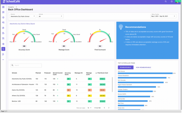
PrimeroEdge Insights — Final UI · ICC Dashboard · Shipped ✓

Final Implementation · Desktop version · Production Ready ✓
Before & After
What the framework actually changed.
The old reality
Comprehensive data nobody looked at. Users bypassing the dashboard for raw exports. No distinction between data errors and real anomalies. Non-analysts blocked without specialist support. 40+ metrics on one screen with no hierarchy. Zero accessibility compliance.
What changed
Three primary metrics surfaced — everything else progressive disclosure. Anomaly flags with clear signal vs. error distinction. Non-analysts self-sufficient on day one. WCAG AA compliant throughout. Zero design debt post-launch. 9 district rollouts on schedule.
Impact
Shipped. Used. Mattered.
The stakes on this project were different from enterprise internal tools. Behind every dashboard metric was a real child in a real school cafeteria. That direct line between design quality and student nutrition outcomes made every decision matter differently — and made the 18-month investment feel proportionate.
5.0
Release Shipped on Schedule
Zero design debt requests post-launch. Rigorous annotation and developer engagement through implementation meant nothing was left ambiguous.
9
District Rollouts
Sole designer across all 9 district implementations. Each rollout validated the design decisions made in the Clarify and Ideate phases.
0
Post-Launch Rework
Three data categories removed in Clarify prevented a post-launch trust problem. Five quick wins shipped before final release improved the product without extending the timeline.
Reflection
What the framework proved. What the stakes taught me.
The Clarify phase is where the project is won or lost. Starting with the data team before users was unconventional — but it prevented building a beautiful interface around unreliable numbers. Three data categories flagged as unreliable in week 2 never made it into the product. If they had, user trust would have been damaged at launch in a way no subsequent iteration could fully repair.
Ideating with real screens, not abstractions, changes the feedback quality entirely. "Can we see Direction 2 with the information density of Direction 3?" is a question that only gets asked when stakeholders can see real screens. Abstract direction presentations produce abstract feedback. Real screens produce real decisions.
What I'd do differently: I would involve actual district administrators — not just sales and support proxies — earlier in the Ideate phase. Card sorting with internal teams is fast and productive, but it introduces a layer of interpretation between the designer and the actual user. One session with real end-users at the start of Ideate would have been worth two rounds of stakeholder reviews later.
Designing for students is different. Behind every dashboard metric is a real kid in a real school cafeteria. That responsibility made me more careful, more empathetic, and better at the one thing data product design demands above everything else: knowing what not to show.
— Mahesh Guntivenkata · Cybersoft PrimeroEdge 2.0